Wood Products Marketing Group
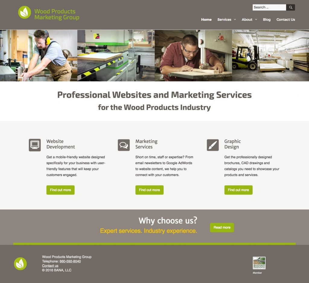 A good business website doesn’t need all the bells and whistles to make a good impression. Here’s an example of how simplicity and clean design can be engaging and effective.
We created this website for our other division, a B2B website development and marketing company that serves wood products manufacturers.
One of our main goals was to keep this site simple, both in terms of navigation and presentation of content. Another priority was to make sure that this website and its core messaging consistently hit the right notes with our target audience.
What We Did
Home Page
Most web users judge a website and its relevance to their needs within the first few seconds of arriving on a web page. Good home page design is critical to establishing the right tone and quickly engaging web visitors.
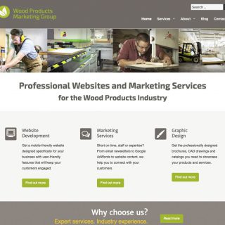
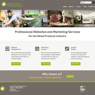
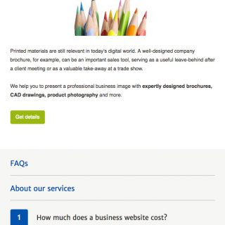
To immediately orient the web user and quickly establish who we work with, we added a prominently placed and clearly worded defining statement below the top banner. Rotating banner images depicting wood products manufacturing further help to define the target audience for this website.
Home page elements such as navigation buttons and contact information are placed where web users would logically expect to find them, making the site easy to use. Three clearly-defined areas of service provide main navigation pathways to quickly steer web users to the information they’re looking for.
Color Palette
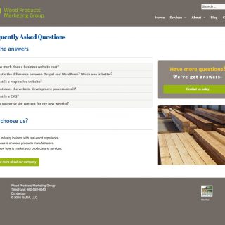
Our target audience of wood products manufacturers is predominately male, so we created a masculine color palette of grays and taupey-brown that was subdued but also contemporary. We used blue headlines and added shots of bright green and gold as accents to liven up the pages and keep them from being too monochromatic.
User Experience
To make moving through the site inviting and effortless, we added CTAs (calls-to-action) and internal links to every page to guide the web user to additional useful content.
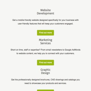
We designed this WordPress website to be responsive, so it displays and functions properly on any device, whether it’s a desktop, laptop, tablet or mobile phone.
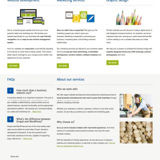
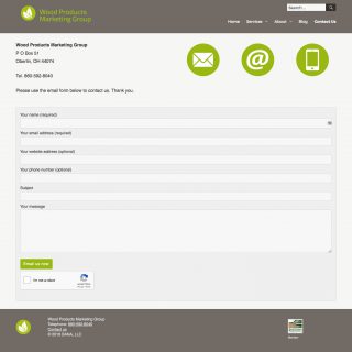
Additional features such as a blog, FAQ section and easy to use contact form contribute to a satisfactory user experience.
Targeted Content
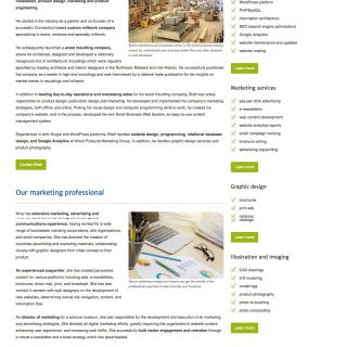
This site is targeted to wood products manufacturers. We carefully developed this website’s core messaging to resonate with that niche audience. Consistent themes and talking points are woven throughout the site’s content and help to form a cohesive message. The website’s text is scannable, clear and to the point and has the tone, language and style appropriate for that audience and their industry.
Website Page Images
Click on a thumbnail to see a larger image and/or begin a slideshow.
To website gallery »