My Cozy Dorm Room
 Third Time’s a Charm
This entrepreneur reached out to us after two unsuccessful attempts at getting a professional website for his new business, a rental service that supplies TVs, appliances and other dorm room essentials to private boarding school students.
The two previous websites that were built for him were amateurish in design, performed poorly and lacked content – all due to limited technical expertise and virtually no planning on the part of the website creators who failed to learn about our client’s business or website goals. He felt frustrated and directionless.
Our client and his business partner needed a quality website with good e-commerce capabilities, an attractive design and a cohesive message. While our client clearly understood the operational aspects of his business, he confessed that he had no idea of how to go about branding his new business, creating an identity or communicating his message.
Our Approach
Our goals for this project were many. Since this was a new business, we had to create an identity, and define the company’s brand, build credibility and establish a web presence. We had to create clear and consistent messaging that spoke to students, parents and boarding schools, and position the company as a trusted partner. We also had to properly showcase his rental products and ensure that ordering online was easy.
We spent time talking to him and his partner about their business, their target audiences, and their website goals, and we provided honest feedback and suggestions. Knowing their e-commerce needs, we recommended Shopify, a highly suitable platform for a small businesses, and we worked with a theme that could be customized to meet their requirements. We carefully researched Shopify apps that would provide the specific functionality and customization they needed.
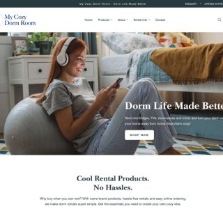
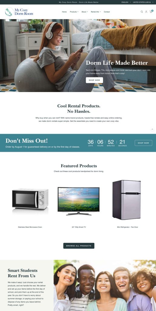
For the look and feel of the website, we developed a concept that focused on student life, and more specifically, students enjoying campus life. By focusing on the student experience, the indirect message was that the company’s products made life better and more fun. Carefully selected stock images helped to shape the business’s image and identity.
We developed a website content strategy which identified and prioritized main content areas, and we created a logical content structure to enable web users to easily access information and navigate through the site. In addition, we wrote targeted and engaging content for the website, incorporating the key messages we developed during our research and planning phase.
The End Result
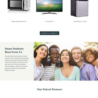
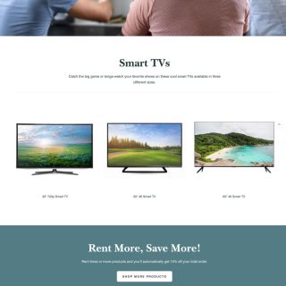
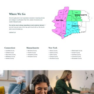
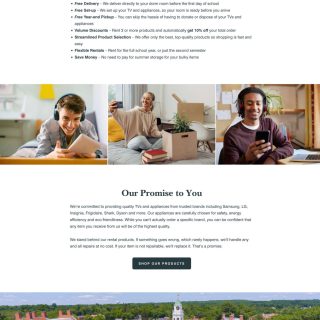
The new Shopify website has a clean, friendly, professional look and feel, which perfectly represents the company’s brand and tells their story.
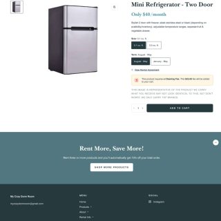
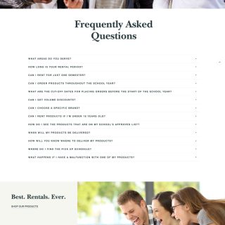
Product-specific pages and e-commerce functionality make ordering easy. The site features the must-haves that our client needed – a countdown timer, customized contact form, automatic volume discounts, and built-in cleaning fees on select products.
One of the features that was most important to our client was private shopping pages for boarding school partners. We created custom pages, accessible through private log-ins, which provide customized shopping experiences with curated product selections tailored to each school’s specific needs and requirements.
Our client and his business partner were more than satisfied, saying their new website was “exactly what we wanted and more…We couldn’t ask for anything better.”
Website Page Images
Click on a thumbnail to see a larger image and/or begin a slideshow.
To website gallery »