Arrowood LLP Law Firm
 Project Overview
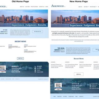
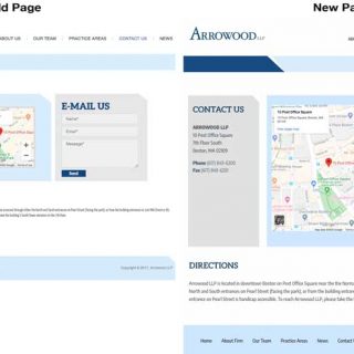
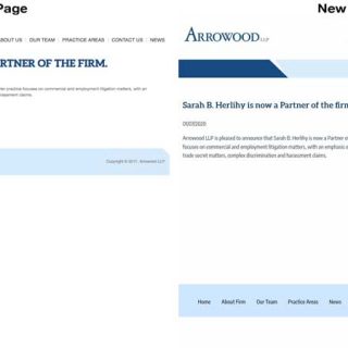
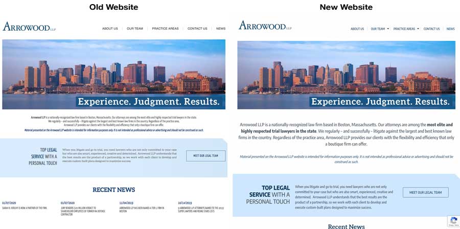
Looking at the two images on the right, you might think these two websites look about the same. You’d be right. But the new website actually is new. It was created to look like our client’s old site, which is exactly what they wanted.
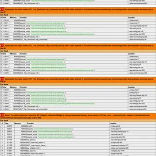
Although we didn’t build the original site, we were asked to take over its maintenance and management because many of its technical demands proved beyond the capabilities of the original web designer. In the beginning, the site worked fine, but then it started having some potentially serious problems.
Much of the site’s functionality was dependent on free third-party plugins. This is a common issue with WordPress sites. The problem is not WordPress itself, but the third-party plugins and the web designers who rely on them. In our client’s case, many of those plugins were badly outdated and/or unsupported, so they posed a real security risk. Alarmingly, some of the plugins were already years out-of-date when the site was originally launched.
One of the big concerns was that the old plugins wouldn’t work with newer versions of WordPress, and that could cause a crash. Using these old plugins meant that our client had to forego important security updates, which is never a good idea.
Knowing that their risky situation would only get worse over time, our client concluded that they needed a new secure, stable website. The only caveat was they wanted their new site to look just like their existing site.
What We Did
We began by rebuilding the site from the ground up. We identified 13 outdated plugins to eliminate. With our custom PHP and Javascript programming, we replaced the functionality of the old plugins with new, rock-solid code. We created new post and page template files, reduced the number of fonts and replaced background images with CSS styling declarations. We performed a thorough house-cleaning, eliminating 13,000 unnecessary meta records, 900 post revisions and 14 MB of old, unused images.
Following our client’s wishes, we created a new custom theme to match the look and feel of their existing site. Although the new site looks nearly identical, we made numerous usability improvements. We made finding content faster by having all pages accessible from the main navigation, instead of some pages being accessible only through other pages. We chose a new body font with bigger leading to make the site’s written content easier to read. On pages with tabbed content, tab panes automatically convert to accordion panels on mobile devices.
Our client’s new and improved website is stable and fast, with a remarkable 300+% load-time improvement over the old site. The site is running the latest release of WordPress without the risk of security updates causing a crash. Best of all, the firm’s corporate branding has remained and all vulnerabilities have been eliminated because plugin dependencies were removed.
Website Page Images
Click on a thumbnail to see a larger image and/or begin a slideshow.
To website gallery »