DDC Clinic ~ Center for Special Needs Children
 Total Makeover From the Ground Up
Very pleased with the robust Drupal website we developed for their genetics laboratory, this non-profit organization asked us to take on another project – a new website for their medical clinic.
The clinic was long overdue for a new website. Their original static HTML website was more than 11 years old. Making any content updates to the site required a web designer and often proved to be time-consuming and costly.
When it came to overall presentation, the site’s content and its messaging missed the mark. It didn’t effectively tell their story or reflect the vibrant organization that the clinic actually is. The website’s content structure was disorganized, styling was outdated, and navigating through the site was cumbersome.
Aware of their old site’s limitations and weaknesses, our clients had specific goals for their new site. As a non-profit organization that depends on donations, their top priority was that their new site would communicate to donors and serve as a fundraising tool.
They also wanted to bring more attention to the clinic’s research, clinical trials and laboratory testing services. Lastly, our clients wanted their new site to educate medical professionals and patient families.
Creating the Right Strategy
Not only were we completely redesigning and developing this new custom website from the ground up, we were also refocusing its messaging and creating all the written content for the site. Proper planning was critical.
Our client was a small country clinic with a very specific focus – treating children with special needs caused by rare genetic disorders. Most of their patients were Amish. Our goal was to make the clinic and its work relevant and relatable to potential donors and the general population.
A large part of the task was determining how best to present the clinic and persuasively tell its story to the online world. Starting with researching more than 30 non-profit sites to study best practices and get ideas, we moved to creating a basic concept for the new site.
We performed a complete inventory and evaluation of all of the written content on the clinic’s old site. We discovered that many major content areas that should have been on the site were simply not there. Content related to actual patients and their stories was almost non-existent. We also found that the existing content was missing one very important element – a human connection. Much of the information was presented in a straightforward, just-the-facts way, and it lacked any emotional pull.
We decided that, above all else, the new website had to “humanize” the clinic and appeal to web visitors’ emotions. If the new site was going to engage people and make them want to donate money, we had to bring more attention to its patients and present the clinic as a caring, compassionate place.
A Successful Outcome
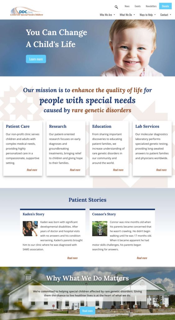
The new WordPress website we created successfully brings our concept to life, persuasively telling the clinic’s story in words and images, and weaving the human element of their work throughout the website.
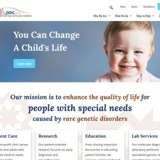
The home page sets a warm and welcoming tone, with soft colors and design elements that convey the clinic’s Amish roots. A large banner at the top features a photo of a child along with a compelling headline that emotionally draws in the web visitor. Clearly organized website navigation and multiple pathways enable easy access to information.
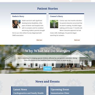
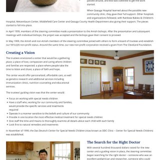
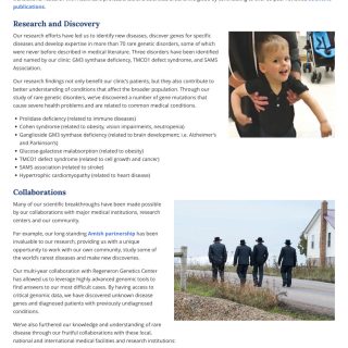
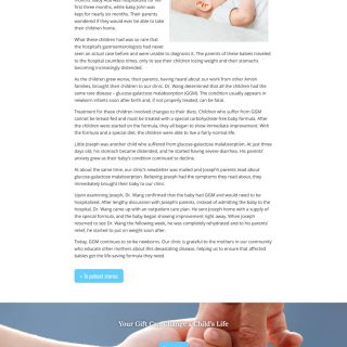
The new site also features personal patient stories, often presented in the words of the parents of the affected children. A staff page includes headshots, bios and quotes from staff about why their work is meaningful to them.
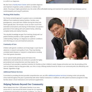
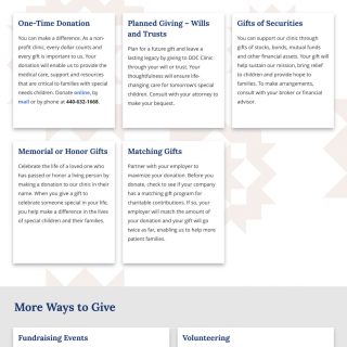
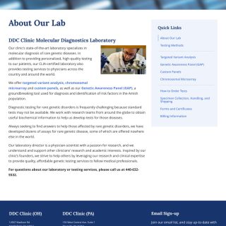
Individual web pages dedicated to patient care, research, laboratory services and education convey the breadth and depth of the clinic’s work. Donor-focused messaging is strategically placed throughout the site, guiding web visitors to the site’s donation pages.
When it comes to updates, the new website’s content management system enables our clients to quickly and easily change content and images on their own.
Our clients were more than pleased with their new site, telling us that we exceeded their expectations and “built a beautiful state of the art website that we will be able to grow with for many years…Sincere thanks for all you do for our clinic.”
Website Page Images
Click on a thumbnail to see a larger image and/or begin a slideshow.
To website gallery »